

I’m so happy that my book ‘Death’s Carousel’ has been released and is now on the market for you to purchase and read. Yesterday’s blog post was all about my book, my books release and a author interview with me all about my book. And I just want to say a huge thank you to everyone who has purchased it and supported me so far. For me this is such a big deal!
But something I have decided to share with you all was my process on how my front cover was designed and made.
Choosing a front cover is scary work, you need it to be eye-catching and not boring, it needs to be in theme with your genre and niche, it needs to tell the story without telling the whole story… Again, it’s a pretty big deal!!!
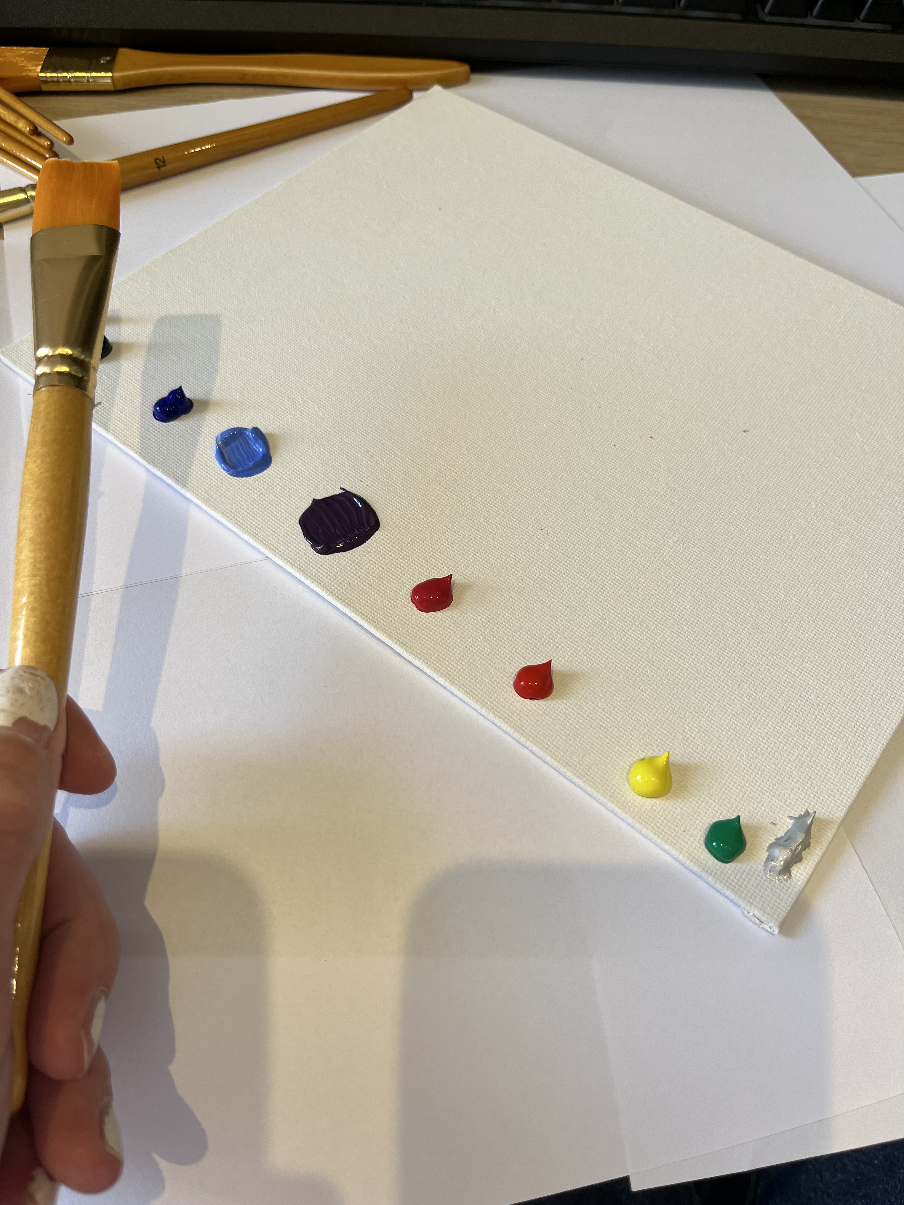
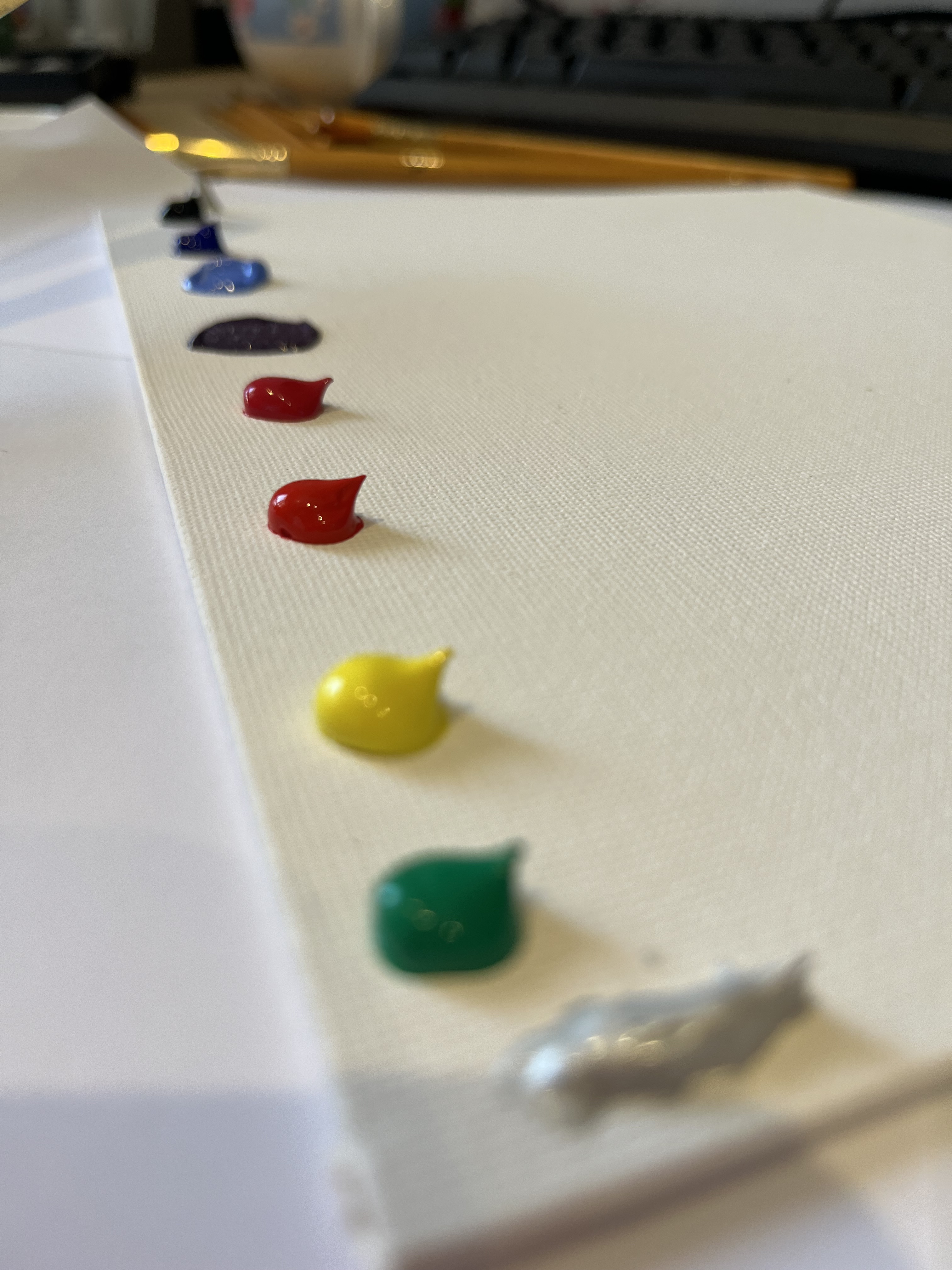
The way I created my front cover was with some rough first drawings, a couple of meetings with my friend Mercedes Prunty who in the end created and designed my front cover for me and then putting them onto a book and ordering proof copies to make sure it was the best it could be for my book.
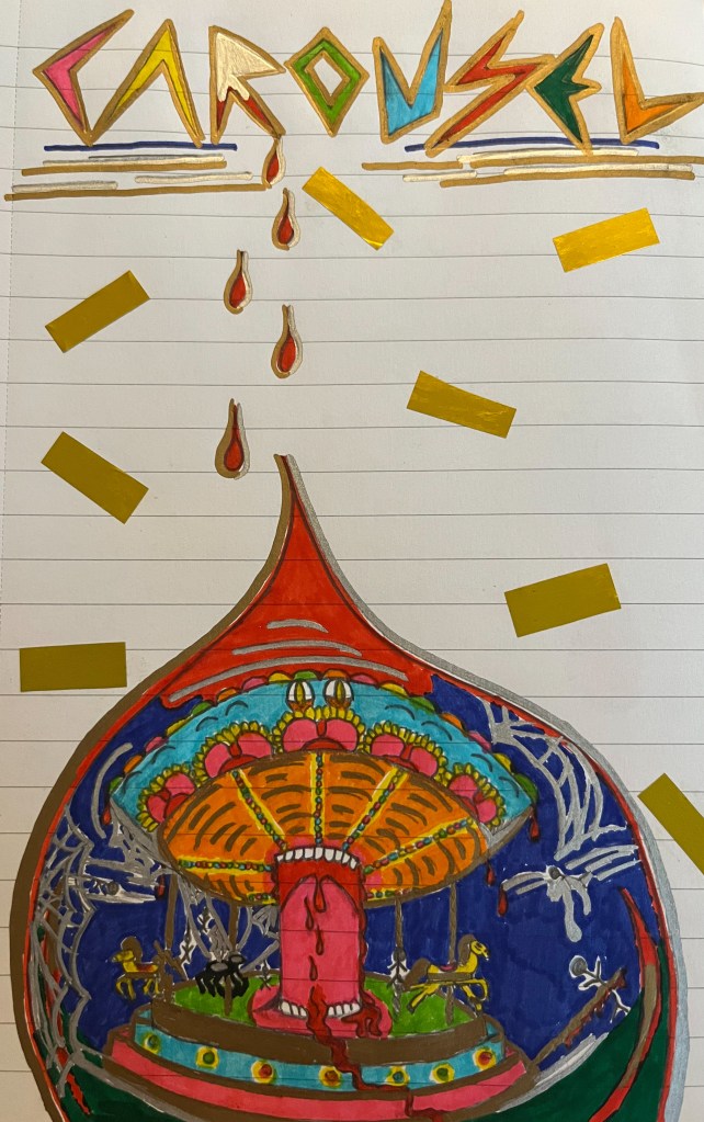
Here is an initial drawing that I drew when I first began writing my book. The Title is in sharp lettering, one of them with a mirrored look to them which fits into the theme of my book where shards of glass and shards of mirrors are used. Then I had the blood dripping down and one of the blood droplets had a reflection of the Carousel at the fun fair. I made it look as if the central column was coming alive to eat you. Although I really love this image, to me it looked a little too childish and I didn’t want people getting confused or thinking it was a kids, Young Adult or Fantasy novel, because it is not, it is a thriller / horror story.
Once I knew I wanted it to look a lot more ‘Grown up’ shall we say, I knew I needed help to achieve that. So, I spoke to my friend and Publisher, Mercedes Prunty, who is also an author herself, but has taken a step back and taken a leap into Cover Design, Publishing and Blogging and Marketing, as she does at times help with my blog when I am struggling or need some guidance.
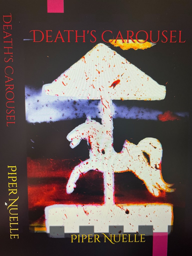
So we decided to have a meeting over a glass of wine and discuss some other ideas. The one we ended up going with was a slight re-imagining of the UK British road sign for theme-park, but with a twist and of course the blood splatters to let people know that it was a thriller come horror novel. I wanted it to be easily recognisable but also unique in its own sense.
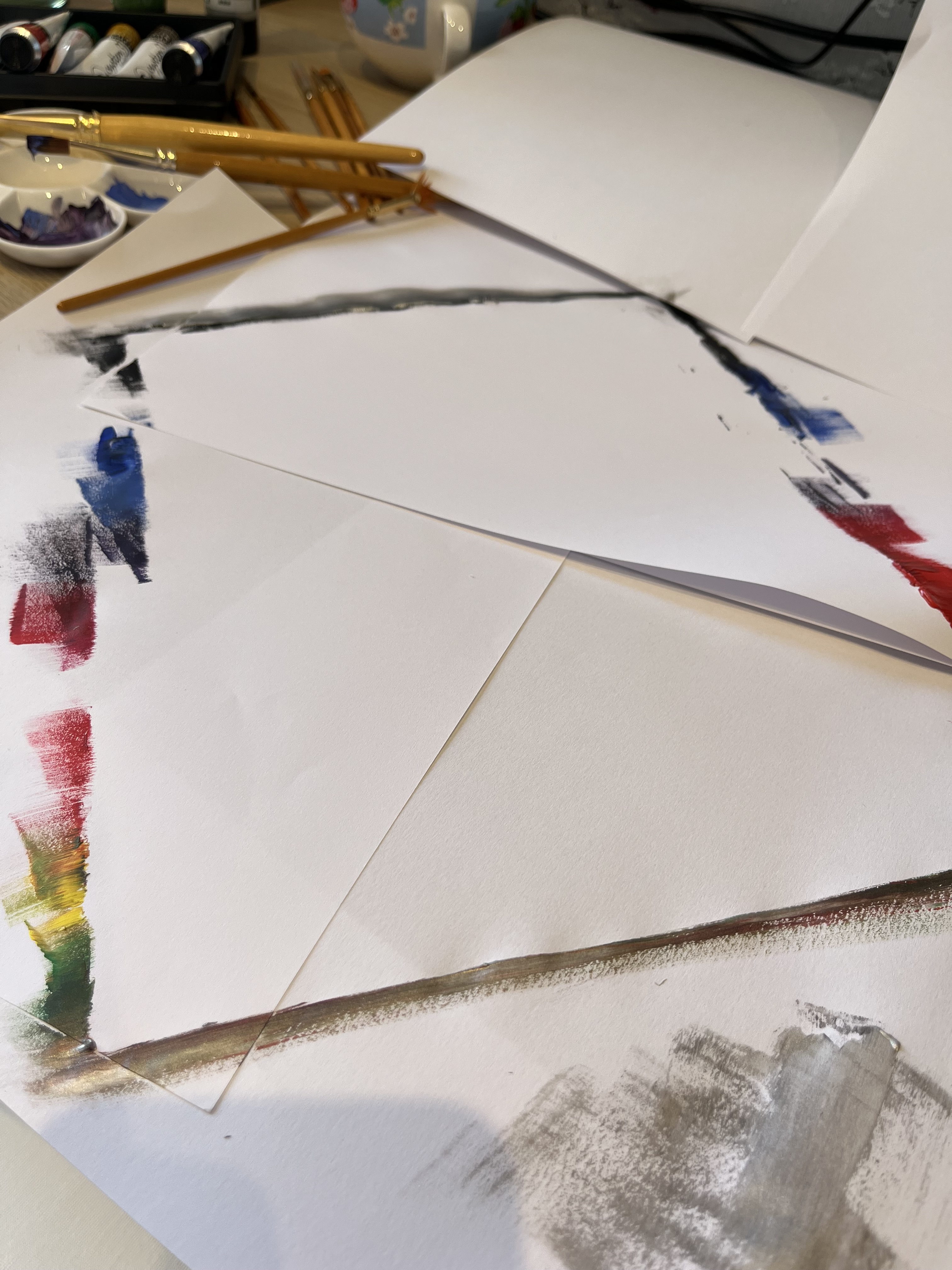
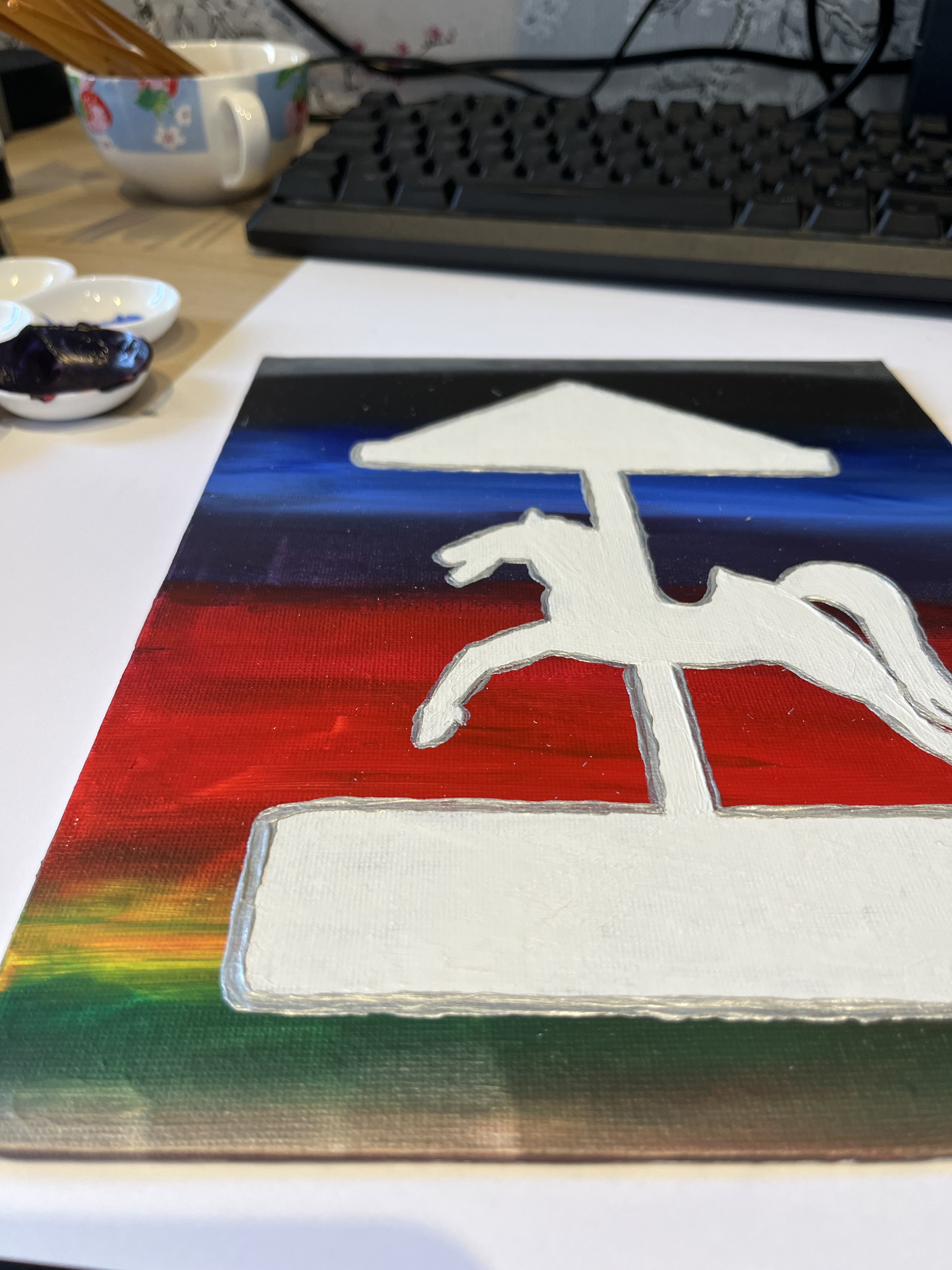
Mercedes of course went away and create a beautiful painting of what I wanted.
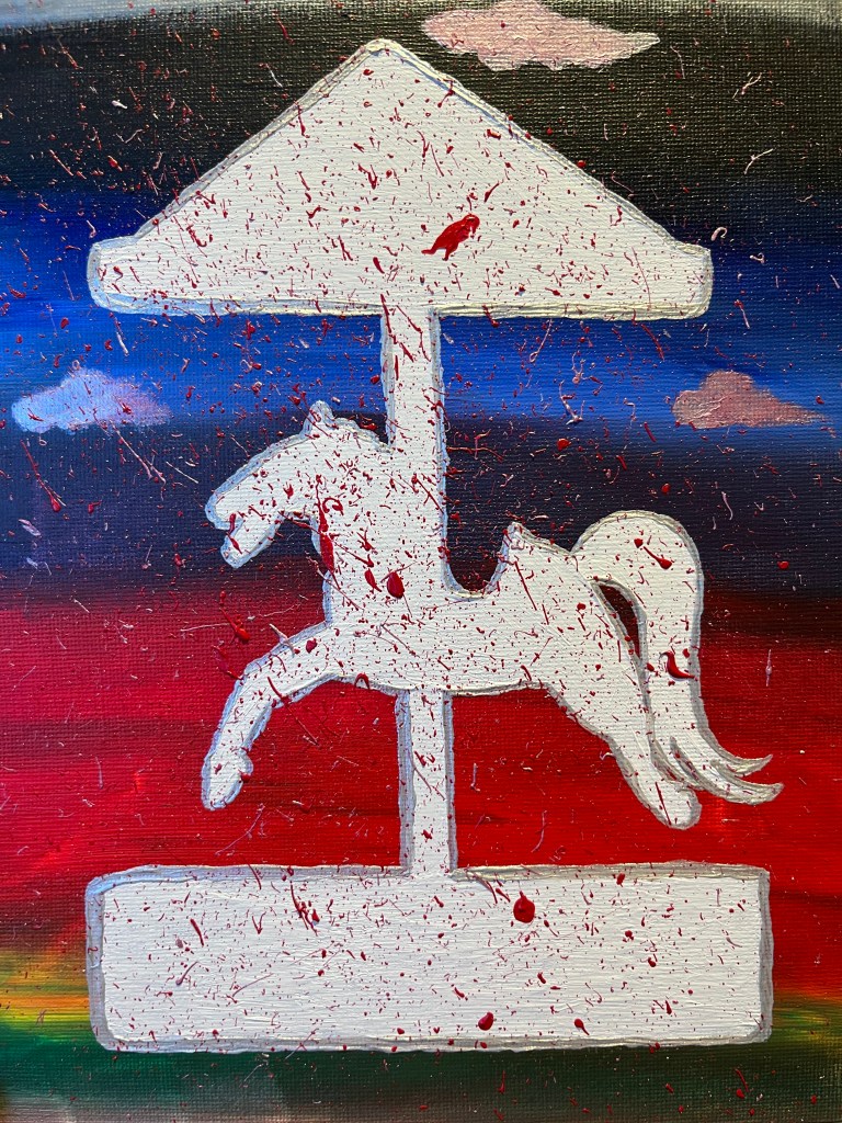
At first I had discussed with her that I wanted bright colours like an actual fun fair, and this is what she came back with. I instantly fell in love with it, but, it was a little too bright and the blood splatters, just looked like splattered paint blobs. So she went away again, edited it on a photo editing app she has and then came back with a darker, more moody version where the splattered actually looked more like splatters of blood than paint. I was amazed and over the moon. She had blurred out the background so it looked like moody weather and almost as if the Carousel was moving and lines of moody red where whipping past it. The horse was fully recognisable from her painting but not so sharp, giving it an almost playful feel to it, as if it was a toy Carousel covered in blood, and it still had some rainbow aspects to it, almost a hint of flashing Carousel lights dancing around the horse.
The next part of the cover I needed to decide was whether it should be in Gloss format or Matt format.
Originally I went with matt, a lot of books in my genre have matt covers. But when I received the proof copy I didn’t like the matt effect. Number one to me it felt and looked more cheaply made and I didn’t think it suited the theme of my book. It also market really easily with finger prints, scratches, and watermarks. So we then decided to go with the gloss look. Which Mercedes showed me one of her books with the gloss and I instantly preferred it. So, I changed that up and made my cover glossy. I feel it suits the book and the theme of the book much better, it gives an almost wet look to the droplets of blood.
With each book format, for example Kindle, Paperback and Hardback the cover is essentially the same but due to sizing and or technicalities for say with the kindle where it may look black and white on a kindle screen and not colourful, there are a few minor differences, but other than that, the covers are all the same.

I am so pleased with how my book cover has come along, from my initial idea to Mercedes creating the real vibe that I wanted to capture, I cannot complain, I’m very lucky in how it looks and I feel it fits the story so well. And who knows, maybe one day I can keep my initial drawing to do a special edition cover if it ever took off. So, it won’t go to waste lol.
If you are interested in reading my book then here is the link to Amazon where you can purchase it – Death’s Carousel by Piper Nuelle
I also have a few signed copies to giveaway, so if you are interested in getting your hands on one then please, comment below on what your favourite element of my cover is for you and then email me at – Pipernuelle@gmail.com with the same answer so I know it is you.
Also a quick disclaimer – If you enter my giveaway please do not respond to any other email addresses than the one mentioned above, and I will never ask for any bank details or for you to pay anything. I will cover the cost of shipping. All I would ask for is an address!!! Which is to send the book to if you win.
I hope you enjoyed my blog post on how my Cover was created.
Let me know, do you like it? And will you be reading my book.
Take care, xo Piper xo

Leave a comment